YMCA Life Skills
A mobile app designed to keep knowledge-seekers coming back for a lifetime of learning.
ROLES
UX/UI Research Lead
UX/UI Designer
Project Manager
TEAM
Brent McCormick
Greg Der Ananian
Steve Stremsterfer
TOOLS
Google Suite / Mural / Figma
DURATION
2-Week Design Sprint


[CLIENT]
YMCA Life Skills, delivered right from the comfort of your smartphone.
The YMCA was founded nearly two centuries ago on the pillars of youth development, healthy living, and social responsibility, offering a wide array of programs and services dedicated to these pillars. As a brand, the YMCA prioritizes “inclusion and accessibility” as core values, and any new YMCA product must have these values in its DNA.
Since research indicates smartphone access to be most prevalent across all income levels, our task was to develop a mobile-first solution designed to encourage sustained engagement with the YMCA’s “Life Skills” resources in the aged 16-25 demographic.
[DESIGN PROBLEM]
Our target user’s first stop was to their web browser, which often led to frustrating results.
First, we needed to address how users wanted to consume the content. How do we design a mobile app that presents content in a way that’s most helpful to our users?
Second, we needed to solve the issues that frustrated them about their initial searches. If we can provide a better way to navigate life skills content, we’ll gain the trust -- and engagement -- of our target users.


DISCOVER
Business Analysis / Surveys
Interviews / C & C Analysis
DEFINE
Target User / Affinity Map
Feature Prioritization
DEVELOP
Digital Wireframes / Digital Prototyping / Usability Testing
DELIVER
Hi-Fidelity Prototype
Discover | Research

[DESIGN HYPOTHESIS]
Users want to “get in and get going,” with filtered, vetted resources catering to their specific needs.
Our target users start their search with a specific goal in mind, but they need information they can trust. They don’t want to sort or filter through dense materials to find what they need.
By customizing the interaction to an individual user’s interests, and quickly connecting them to concise, digestible content, we’re able to create meaningful engagement from the very first sign-in.
[RESEARCH & INSIGHTS]
Leveraging the YMCA brand wasn’t enough: We needed a better learning app than the competition.
100% of Users
Understood the term “Life Skills”
82% of Users
Do not use the YMCA facilities or resources
76% of Users
Wold trust learning Life Skills through the YMCA
User interviews and Surveys indicated that our target users were already seeking ways to learn these life skills, but weren’t finding it all in one place.
47% of Users
Would engage with an app for “Life Skills” content
100% of Users
Would start their new “Life Skills” learning with a Google/browser search
"My Parents were bad with it, so I didn't want to follow their example"
"I learned most of what I cook from watching videos on my phone"
"I need to understand credit if I want to buy a house one day"
A Competitive & Comparative analysis helped to identify common interface design and successful features amongst other mobile learning tools.
The rationale was this: The more familiar a user is with the interface and layout, the sooner they can focus on discovering and learning.

Define | Synthesize
Affinity Mapping allowed us to develop a user Persona, and led us to highlight four key insights in our quest for engagement.
[Key Insights]
-
Painless onboarding to quickly engage and build trust.
-
Learning tools and paths customized to the user’s interests and needs.
-
Gamification helped users to track their progress and stay engaged with the material.
-
Forums and Discussion threads as a supplemental resource to the video courses.

Develop | Ideate
“All Aboard!”
Designing a fast, logical onboarding and a custom learning experience.
Sketching, Wireframing, Prototyping and Usability Testing all led us here, to a high-fidelity prototype informed by insights from our research and refined through our testing.

[Deliverables]
Sign-In
Accommodates for varying levels of trust, keeping the user in control of how and when they’re sharing personal information.
Customize
Allows for self-selecting personal areas of interest, and clearly states the information is being utilized to tailor the experience to the user.
Quickstart
Highlights the key features in a quick explanation, showing the screens in context. A new user is provided a bit of context on how to navigate before thrown right in.


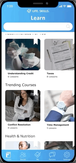

Learn
Course browsing, highlighting Recommended Courses and Themed Lists, all based on your preferences.
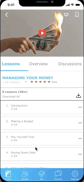
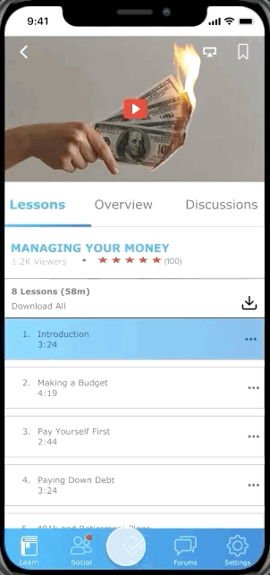
Courses & Lessons
View the lessons, track your progress of completed videos, see related courses, Download for offline viewing, or post a new thread in the course’s discussion forums.
This is where the focused learning is done, and was designed to put everything needed right at the user’s fingertips.


Social
Badges, point totals, and progress tracking all provide logical metrics for sustaining engagement and positive reinforcement.
Me
The central hub of the user’s personalized experience. Track Progress, Bookmarks, User Stats, Recommendations, and Downloads.


Forums
A supplemental resource to the Courses and Lessons, providing users a platform to ask further questions and get answers.
Deliver | Implement
So Now What?
Our initial design and research work made some enlightening progress, but further steps were identified.
Focus on Forums
Early usability testing indicated that this feature was confusing to navigate, and users weren’t exactly sure what they’d find there. This led us to question the basics: How does it work? How is it sorted, filtered, or searched? Who posts? Who responds? How is the content monitored?
We rushed the “Forums” feature into the prototype, without sufficiently planning its implementation. Moving forward, we’d propose mapping out a clearer implementation.
Make Gamification Single-Player
Usability testing and feedback indicated that gamification was a personal motivator, but not when framed as a competition against others. We’d propose refocusing the scoring and metrics used, and to redirect the gamified elements towards rewarding sustained engagement.
Expand the Courses
Explore opportunities to grow the course library, like videos funded through branded partnerships, as well as ways to connect the app to in-person courses to compliment the video courses.


