AllTrails
Helping a gold-standard hiking app shine even brighter.


*redesigned screens
AllTrails is a crowdsourced app for planning hikes, recording hikes, and an all-around resource with 100,000+ trails for the trail lovers and trail-newbies alike.

Product & Content Designer
UX Researcher

3-Person Team

4-weeks
(Conceptual)
What was I thinking?
Let's start with a little context, shall we?
This project was conceived - and remains - a purely conceptual redesign. We weren’t paid, and AllTrails didn’t ask for this.
AllTrails is already adored by its 20+ Million users.
500,000+ app store reviews later, it still holds a 4.9/5 rating.
Even if they desperately needed design updates, they have their own team.
So why do it?
I wanted to explore the challenge: How do you improve upon a design with no obvious flaws?
What could the best-of-the-best be doing even better?
DISCOVER
DEFINE
DEVELOP
DELIVER
-
Business Analysis
-
Heuristic Analysis
-
C & C Analysis
-
Feature Inventory
-
User Interviews
-
User Surveys
-
User Reviews
-
Persona
-
Feature Prioritization
-
Journey Map
-
Storyboarding
-
Affinity Mapping
-
Sketching
-
Wire Flows
-
Wireframes
-
Mid-Fi Prototype
-
Usability Testing
-
UI Design System
-
Brand Style Guide
-
Hi-Fidelity Prototype
This is a breakdown of my team's design process. I included it for reference, but we won't go through all of it. Don't worry, there's plenty of other good stuff here!
The Problem
AllTrails relies on crowdsourced information on all their trails, so they live and die by the quality and accuracy of that information. But what if that information isn’t reliable enough?
How do we improve the quality and quantity of the information provided by (and to) AllTrails users?
Research
I wanted to understand both what AllTrails gets right (which is a lot!), and what frustrates its users.
I sought to learn from first-hand experiences and comparative research, with a good mix of qualitative and quantitative methods to avoid purely anecdotal data. I even read every app store review from the past 18-months, looking for patterns or consistent complaints.
What I found were devoted users who enjoy using AllTrails to plan their hikes, but often run into three main complaints:
-
They question the accuracy and quality of the trail information
-
They want a better (and faster) way to filter and search
-
They find the "In-hike" features aren't sufficiently useful

existing AllTrails interface
Sometimes unreliable about the distance or elevation and unless you read deep into the reviews you won’t be able to see the misinformation.
The filtering option sucks, and the individual trail page isn't that helpful unless you're tracking a hike.
The photos aren’t great, there isn’t a lot of context about what to pack, weather could be more integrated, more activities and spots to stop could be indicated.
Key Insights
Users rely on reviews - not necessarily the trail card - for critical details.
Trail conditions are very important, but currently, not easy to find. Users typically look at recent reviews to check on trail conditions.
Often, they’ll reference photos in those reviews to assess the difficulty of the terrain and the appeal of the scenery.

Revised version

existing AllTrails interface
Everyone uses the app to plan hikes, but very few are recording their hikes.
Since the information used to plan the hike is generated by reviews, trail information is being supplied only by the small subset of hikers who’ve recorded the hike and the review it prompts.
-
98% of users hike upwards of 6x a year
-
57% of users hike more than 12x a year.
These users could potentially provide massive amounts of useful, reliable, and consistently updated data to users planning their hikes.
Synthesis & Iteration
Through collaborative discussion and debate, my team identified five priority features. We split these features amongst the team.
I became the end-to-end, lead designer of two (in bold):
-
Upgraded Record Hike Screen
-
Improved Post-Hike Review
-
Smarter Search Functions (like keyword searching reviews)
-
Trail Comparison Tool
-
Live (crowd-sourced) Trail Updates for current trail conditions
From Sketches to High-Fidelity
Ok, Brent... So now what?
In order to get a sense of the design thinking, we'll focus more singularly on these features, taking you from hand-drawn sketches to glorious Hi-Fidelity.
A lot of thought and countless decisions went into these designs, but we'll focus on the design decisions that had the greatest impact.


existing AllTrails interface
Analog
I approached my designs with two key insights in mind:
-
The most useful information for hike planners comes from the trail reviews and recordings of hike takers.
-
The more appealing we make it to provide that data, the better the information becomes.

Top: Original design
Bottom: Updated
-
Less "stuff" cluttering the screen, so more focus can be put on the priority functions.
-
A new, streamlined navigation bar, to declutter the menu and focus on priority functions.
-
An "Add" button, for all subsequent map alterations, including existing features (map layers, overlays, photos, waypoints) and new ones (live trail updates).
-
The Record/Pause button was moved to a tougher "thumb zone", to avoid accidental taps.
-
To further avoid accidental tap, "End Record" was connected to the hike stats sub-menu.
-
For live updates and adding photos, two options were considered: as a pop-up menu, or included in the navigation bar.


-
In-app camera would mirror iPhone functionality to capitalize on familiarity.
-
Quick capture prompts a request to pin, making it easier to sync photos directly to the trail.
-
Camera filters will be available to encourage the best looking photos possible.
-
An option to retake will allow for the best photos possible.
-
"extraneous" information and options are moved to a sub-tab.
-
Hike info (distance, pace, duration) moved to the bottom to maximize map onscreen.
-
Side Tab for map functions (waypoints, photos, overlays, map layers)

Digital
Those sketches were just the start.
(And yes, if I hand-draw something it looks like a cartoon.)
Proceeding to digital wireframes, my team assed our designs for any notable flaws or miscues. I really pushed our team to be open-minded and meticulously critical of our designs. The team wholeheartedly bought into the process, and produced some excellent results.
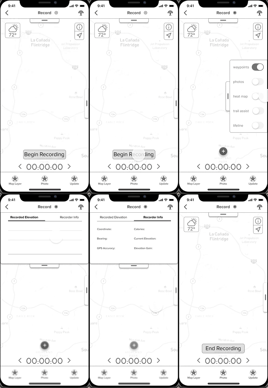
Record Hike
The Record Hike feature enables users to track their journey, add live trail updates, and add geotagged photos. This is all useful data when connected to a trail review.
-
Record Status indicator added to the header
-
Originally hidden, sub-menus were abandoned, and all priority features (Overlays, Updates, Camera) have consistent functionality -- all coming in a pop-up tab from the navigation bar.
-
Downloading the map is auto-prompted when the record screen is selected (since key functionality depends on it).
-
Map Layers & Overlays were switched from toggles, to "filter" style, mirroring the iPhone camera interface.
-
Instead of hidden buttons and outer thumb zone stretches, the Record/Pause/Hike selections share a two-step process. This avoids any confusion on status or accidental selection.


mid-fidelity


Final


mid-fidelity


Final
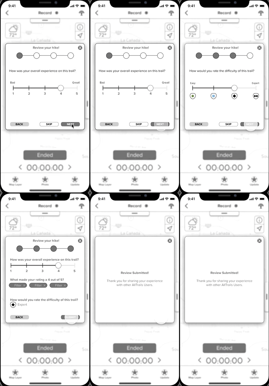
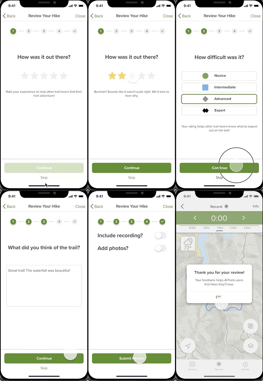
Review The Hike
The purpose of the post-hike review is to gather the most valuable information possible for other hikers to use - and do so as painlessly as possible.
To that end, Sliders and radio buttons were replaced with bigger, more easily-tappable options.
-
Prompts overall rating, uses brand voice to confirm rating matches the experience.
-
Prompts rating of trail difficulty, as an extra layer of validation to the standardized rating system I created.
-
Prompts a text field for uncategorized feedback, that can only be expressed in the user's own voice. This prompt offers the option to dictate instead of type.
-
Prompts pre-populated keyword tags for easy selection.
-
Prompts inclusion of trail Photos & GPS recording (duration/pace).
Extras
But wait... There's more!
While these two particular features represented my main contribution to the project, additional layers of complexity were integrated into the designs of both.
In addition to the "Record Hike" and "Review" features, I designed the following:
-
Trail Difficulty Rating System
-
Brand Voice (Style Guide)
Trail Difficulty Rating System
Users found the trail difficulty ratings to be inconsistent and lacked a clear delineation of what metrics were used to create the ratings.
I designed a standardized rating system based on three key metrics, to help provide accuracy and consistency to the ratings.
-
Distance
-
Elevation change (+/-)
-
Grade (Slope)
The design leveraged commonalities between various regional trail difficulty charts*, and borrowed the visual system from ski slopes.


Final version
Mid-Fidelity
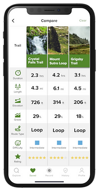
Trail Comparison Tool
After this feature underperformed in usability testing, I iterated a few design revisions that ended up in the final version:
-
Consolidating all compared trails onto one screen, negating the need to scroll.
-
Include photo thumbnails that match the trail card, as the visual is a stronger memory trigger than name alone.
-
Zebra striping the comparison categories to minimize cognitive load.
Brand Style Guide
One frequent comment amongst the research was that AllTrails lacked an identity - That it had no clear style, voice, or personality.
While likely the result of the crowdsourced nature of the app, the lack of a true brand identity impacts the consistency and tone of AllTrails as features are revised and added. Left unaddressed, inconsistent and unpredictable interactions could discourage users.
I created a brand persona, and brand voice guidelines, embodied by a character named "Chip".
Because AllTrails is like an on-demand Park Ranger, I devised the brand voice to read like a friendly, outdoorsy Ranger in a wide-brimmed hat -- With a bag full of survival skills and know-how.
I created a term list of key attributes, tone in various interactions, and included a few quirks to make it all a bit more playful.
Plus, what self-respecting park ranger doesn't like the band Rush?


